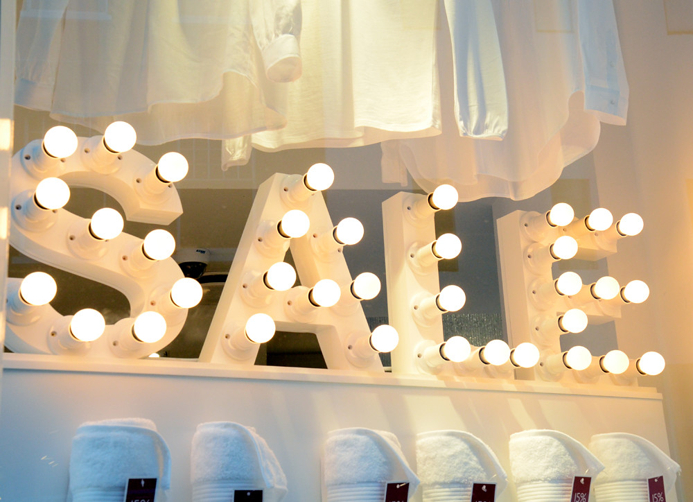
The White Company
Have you done any great bargains at the current sales season? I sure did! A pair of glitter shoes from ZARA for only 10€ – I couldn't believe it!
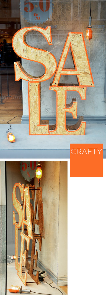
Levis
Ein Schriftzug, welchen uns häufig alle Bankbedenken über Board werfen und nach den reduzierten Artikel langen lässt, ist das meist in Rot gehaltene SALE-Sign. Habt ihr jedoch schon einmal bemerkt, dass manche Brands mehr Gedanken und Design in diese Schilder stecken als andere. Auf meinen Wanderungen durch London hab ich meine Lieblingsschaufenster festgehalten , welche mir in Hinsicht auf Typographie oder Brand-Konsistenz auffielen. Was ist Euer Favorit? Ich würde wahrscheinlich die Buchstaben der "White Company" erwählen, welche von 35 Glühbirnen beleuchtet werden.
Habt ihr ein Schnäppchen gemacht während der letzten SALES-Tage? Ich hab es seit langem mal wieder geschafft: Glitzerschuhe von ZARA für 10 € – kaum zu glauben ;)

Swarovski


Anthropologie
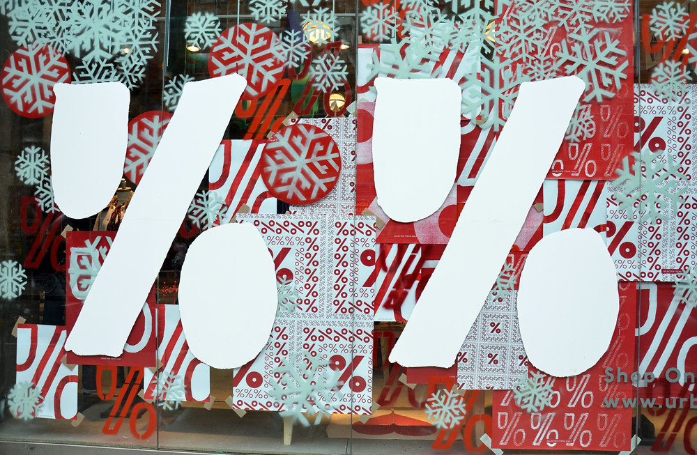
Urban Outfitters


1 Kommentare:
I love searching for different fonts. It's amazing how many similar ones start to pop up and how different ones can look great in one setting and bad in another.
The font that I use a lot (and the one on my green juice recipe) is Strangelove from Veer. It's my go-to style. Hope you have a wonderful weekend!